How to Design Clear Edible Toppers for Better Contrast

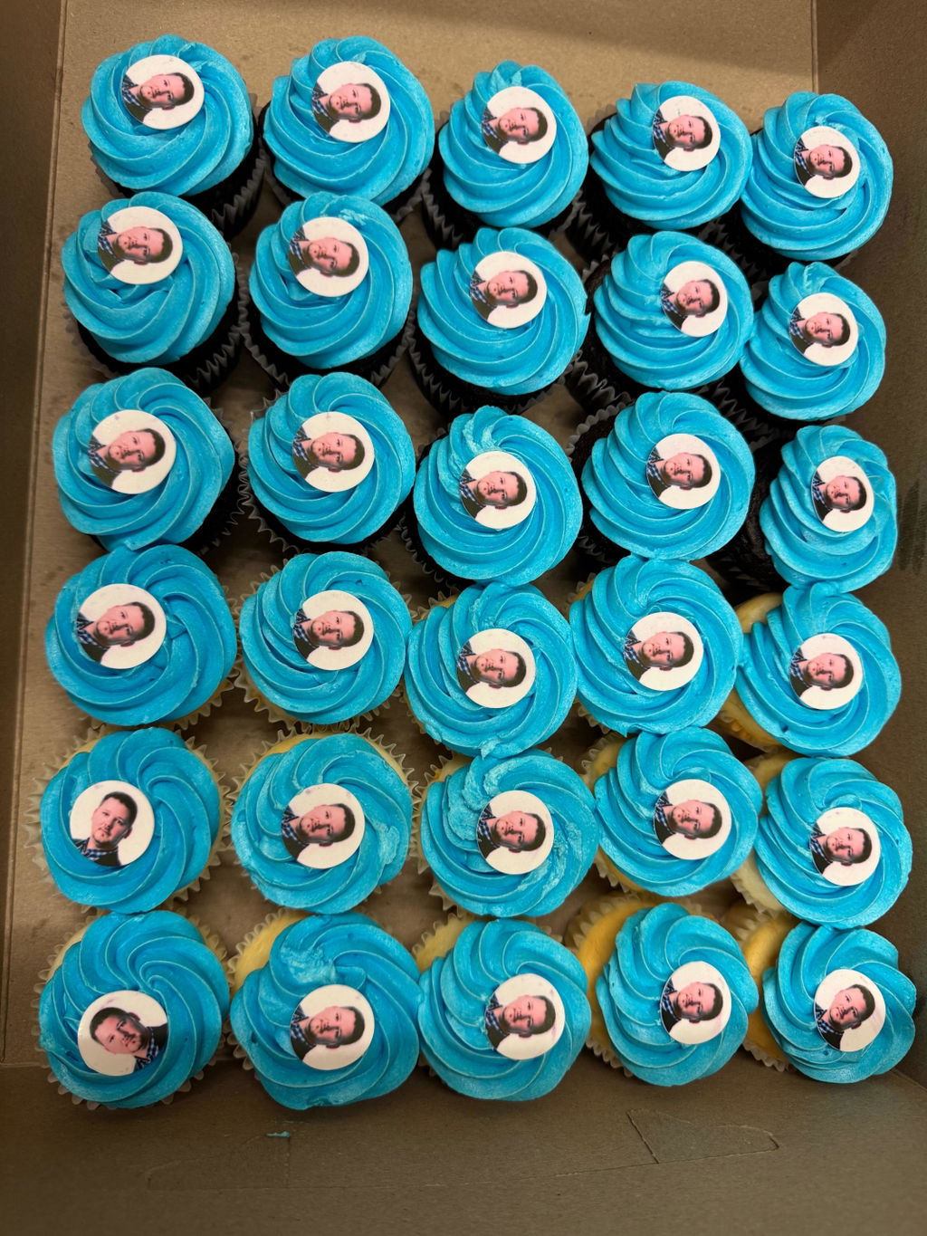
A colourful design on a white screen is only half the picture. With a fully transparent edible sheet, the drink, foam or dessert underneath becomes part of the final design.
Four ways to plan stronger contrast
- Name the surface before choosing colours. The clear translucent edible sheet is designed to remain see-through. Pale foam can support darker, saturated artwork; a deep-coloured drink may make the same artwork feel quieter.
- Use a bold silhouette. Simple icons, thicker outlines and larger lettering usually remain easier to recognise than fine scripts, thin borders or tiny details.
- Make transparency intentional. Do not judge the file as if it will sit on an opaque white card. Empty areas will reveal the surface below, which can create a floating-image effect when the composition is planned around it.
- Preview at the real size. Check the proof without zooming, then test a spare piece on the same type and colour of surface. Event lighting, foam colour and the drink itself can all change perceived contrast, so avoid assuming one universal result.
Tap for the two-background audition
Place an ordinary-paper print beside a pale and a dark colour sample—without putting non-food paper on food. If key details disappear in either setting, simplify the artwork or strengthen its contrast before approving the edible proof.

Use the right material name
This guide applies to the store’s fully transparent clear sheet. Semi-clear sheets, ultra-thin icing and wafer paper have different appearances and handling, so do not transfer this colour advice to them automatically.
Planning a floating-image design? Review the current uses and ordering instructions for clear translucent edible sheets, and include the intended surface colour with your artwork.