How to Colour-Match an Edible Topper to a Wedding Invitation
Which blue belongs on the wedding cupcakes: the lavender in the thistle petals or the slate blue in the ribbon? Both are in the invitation. Picking the detail you want to echo makes “match the blue” a much easier request.

Pick a reference you can put on the table
Keep a printed invitation or a spare length of ribbon. If the invitation has several blues, mark the one you mean on a copy. You’ll have something to hold beside the edible print when it arrives.
Give each shade a letter
Make three copies of the same topper artwork at its finished size. Change only the background colour. For the thistle design, you might try a lavender-blue A, a slate-blue B and a teal-blue C. Put the letters beside the designs in your reference file so they stay out of the final artwork.
Choose under the party lights
Request samples on the material you plan to order. Lay each printed option beside the invitation under lighting similar to the reception’s. Step back to where a guest would stand. Which one picks up the ribbon colour and still lets the little thistle stand out?
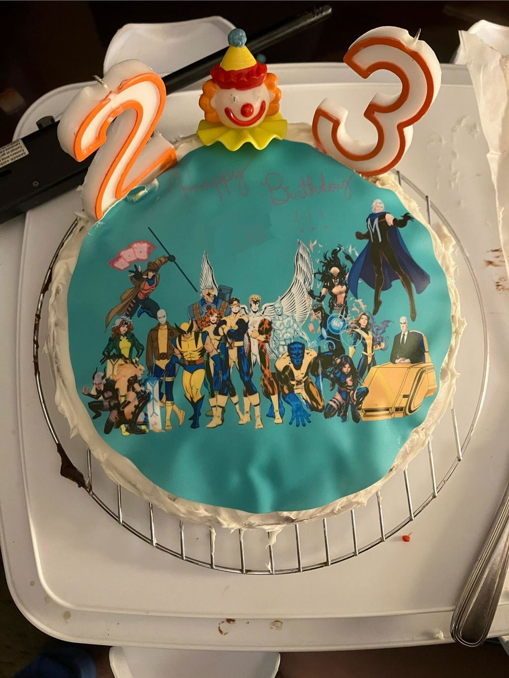
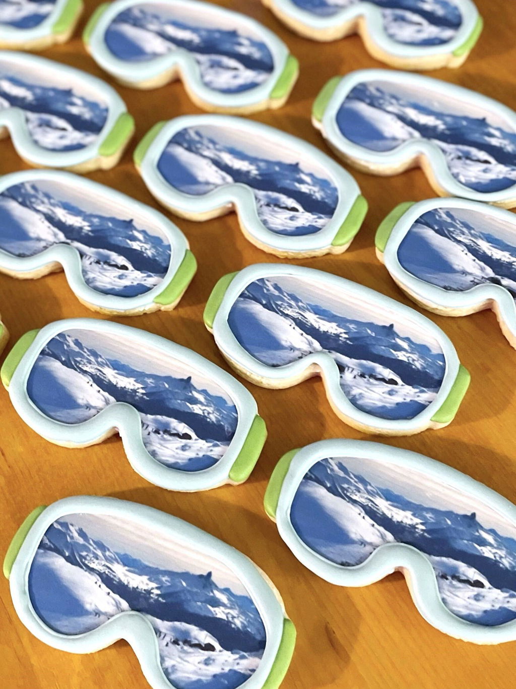
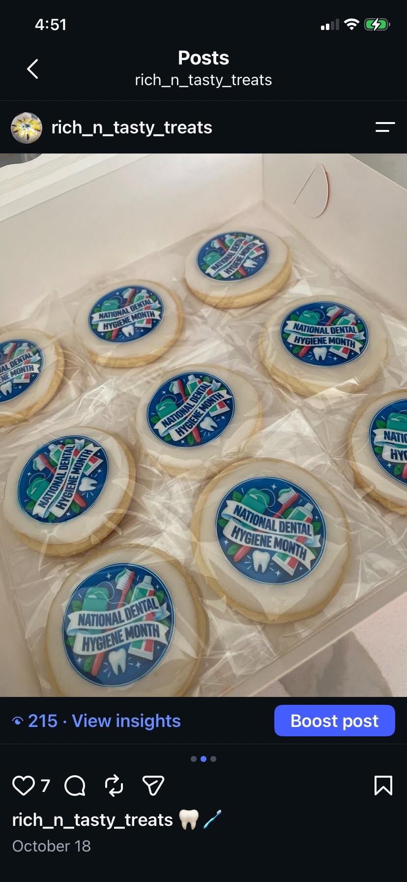
When you request an Edible Print Sample Kit, use the checkout note to name the material, the reference detail and the shades you’d like to compare. Once you’ve chosen, send the winning letter with its artwork file so we know exactly which blue you mean.